The Visualization Toolkit
Know your toolbox. This isn't exhaustive, but these are the visualizations you'll reach for most — and for each one, there's a specific job it's best at.
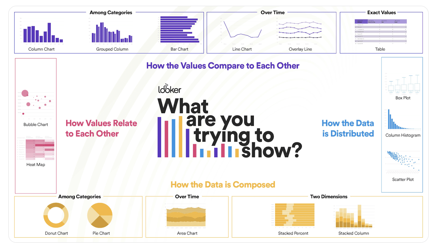
Placeholder: interactive chart selector — describe your data and audience, get a recommended visualization type.
Distribution Plots
- Histogram — distribution of a single continuous variable. Best for: "what does this variable look like?" Accessible to almost any audience.
- Box plot — distribution plus outliers, often broken out by category. Best for: "how spread out is this?" Requires statistical literacy to read.
- Violin plot — box plot with the underlying distribution drawn on top. Richer than a box plot; harder to read. Reserve for technical audiences.
- Swarm plot — shows every data point as a dot along an axis. Better than box plots for small datasets where you want to see individual observations.
Relationship and Category Plots
- Scatter plot — relationship between two continuous variables. Best for: "how do these two variables relate?" Works for any audience.
- Pair plot — all pairwise scatter plots in a grid. Indispensable for EDA; too complex for executive presentations.
- Heat map — correlation matrices or matrix-shaped data, color-coded. Best for: "what's the structure of relationships?"
- Bar chart — counts or frequencies across categories. Best for: "how many in each category?" Universally readable.
- Line plot — trends over time or sequential data. The default for time series. Widely readable.
Read the Room From the Dashboard
You can often tell a company's culture from its analytics dashboards. A startup with engineering DNA will have violin plots and pair plots. A consumer-facing company with marketing DNA will have bar charts and pie charts. A consultancy will have whatever the client expects. None of these is wrong — they're matched to the audience.
You want to show how the distribution of customer purchase amounts differs across three customer segments. Which visualization is most appropriate for a mixed technical/non-technical audience?